In the Press | Design Week

Canadian design and manufacturing company Bocci has unveiled its new identity by Studio Frith, portraying “the allure of abstraction” integral to its lighting designs through a new logo.
Studio Frith founder Frith Kerr describes Bocci as “a lighting company that is so much more than that”. The company specialises in sculptural lighting and large light installations.
Frith says that rebranding a “highly successful company” often involves uncovering “more of its character and culture to bring distinction to its future planning”. Studio Frith looked to Bocci’s design and making process to reveal its character and what distinguishes it in the lighting design space.
“Our overriding impression was one of experimentation and a free-flowing exchange of ideas and materials”, says Frith. In a bid to “turn the inside out” and reveal previously hidden aspects of Bocci’s practice, the studio created letterforms for the name Bocci “using the abstract forms that they make”, she explains.
“The allure of abstraction” is a how Bocci connects with people, according to Frith, which is why this “fundamental” part of its practice sits at the heart of its new identity.
Abstraction was also a key influence for the brand’s new display typeface, Bocci Type, designed by Studio Frith and produced by Dalton Maag. Frith says the design team focused particularly on practices used in Bocci’s glass workshop. Studio Frith senior designer Claire Köster says the display typeface “references the circle and the beginning of every experiment that Bocci undertake”.
Köster tells how Bocci’s typographic language seeks to “capture some of the play and warmth” of the brand. A secondary typeface used throughout “sits, or rather moves, somewhere in between a serif and sans-serif typeface with mechanical details and tall, human proportions”.
This is also used for the company’s product numbering, which she adds is “core to Bocci’s own language” as it plays an important part in how the company works and develops its products. “Indirectly, numbers represent the precise relationship between heat, material and time” in glassmaking, says Köster, while directly they come into play through Bocci’s process and product-development and its “complex cataloguing system”.
A design challenge presented itself through what Köster describes as an “interesting tension” between Bocci’s position as “a renowned business on the outside” and how, from the inside, it is viewed as a “dream art school”.
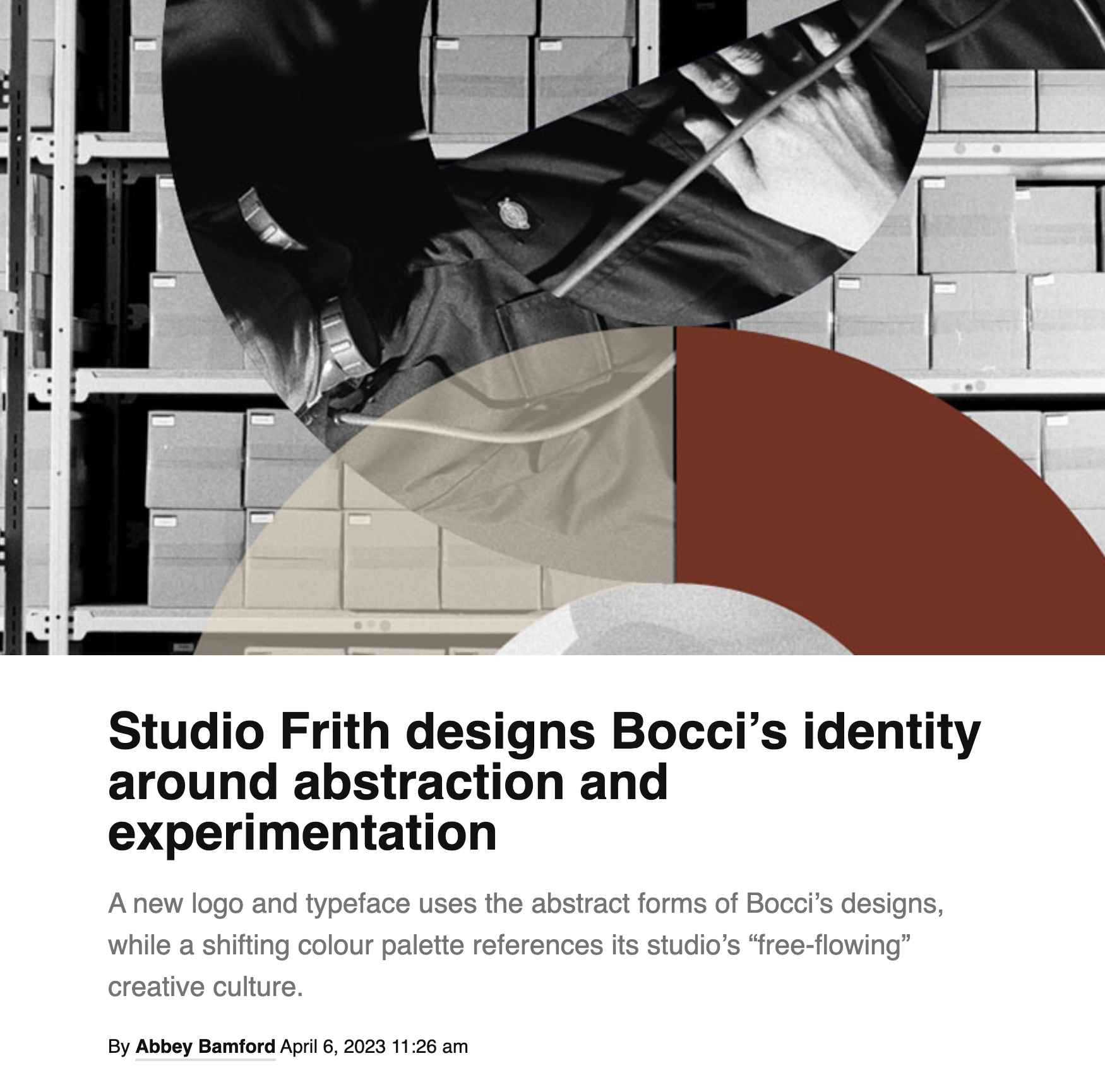
Studio Frith sought to blur the invisible line between Bocci’s two worlds through a colour palette that shifts between light and dark, with further transformations in translucency, form and movement. While colour sometimes appears solidly “in moments throughout collateral”, Köster says that “more often than not it forms a conversation with Bocci’s process-driven brand imagery” with was created by Vancouver-based photographer Fahim Kassam.
The additional form of photography allowed Studio Frith “to tell some of Bocci’s story”, says Köster. Frith adds that the imagery “continues the theme of turning the inside out, showing the life behind the beauty”.
Posted April 6, 2023

